How to Create Your Own Gatsby.js Theme Part Two
March 27th 2020
In Part One of our tutorial on how to create a Gatsby theme we discussed:
- Setup our Yarn Workspaces so we can develop and test our Gatsby theme as a workspace dependency
- Installed the
gatsby-source-filesystemandgatsby-transformer-jsonplugins to source and transform our data which is stored at/src/data/Project.json - We defined a
gatsby-node.jsfile which makes sure the folder/src/datafolder exists and creates it if it does not - We added a
slugfield to our GraphQLProjecttype definition and used createResolvers api to resolve theslugfield to be the slugified value of the Project’s name - Finally, we used the createPages api to get all our projects defined in the
Project.jsonfile and loop through them creating Gatsby pages for each project and passing theslugfield as the path and the project id as the context - We defined a template in
/src/templates/project.jsand ran a pageQuery to get the data for each project and pass it to our React Component.
In Part Two of How to Create Your Own Gatsby.js Theme we are going to discuss how to use the theme we developed as a dependency in another Gatsby project, how to install Theme UI in our gatsby-theme-portfolio and how to extend, override and use component shadowing in our test-site to extend our theme.
Installing Theme UI
Theme UI is a library for styling React apps with user-configurable design constraints. It allows you to style any component in your application with typographic, color, and layout values defined in a shared theme object.
Gatsby has a plugin that helps with the configuration for Theme UI. Let’s install the dependencies for our project in our gatsby-theme-portfolio
yarn workspace gatsby-theme-portfolio add theme-ui gatsby-plugin-theme-uiNow we can add the gatsby-plugin-theme-ui to our gatsby-config.js plugin definition:
module.exports = {
  plugins: [
    {
      resolve: `gatsby-source-filesystem`,
      options: {
        path: `./src/data`,
      },
    },
     {
      resolve: `gatsby-transformer-json`,
      options: {
        typeName: ({ node }) => node.name
      },
    },
    `gatsby-plugin-theme-ui`
  ],
}
The gatsby-plugin-theme-ui expects an index.js file to be located at src/gatsby-plugin-theme-ui/index.js in which we can export our style object which we can use throughout our components for styling definition. We are also going to use @theme-ui/presets module to start with our Tailwind CSS preset. Let’s first install that dependency:
yarn workspace gatsby-theme-portfolio add @theme-ui/presetsNow we can create our index.js file located at src/gatsby-plugin-theme-ui/index.js
import { tailwind } from '@theme-ui/presets'

export default {
  ...tailwind
}
This is pretty simple but it gives us a lot of default definitions that we can use (and eventually override) in our components using the sx prop provided by Theme UI. Let’s take a look at what this would look like in our src/templates/project.js file:
/** @jsx jsx */
import { jsx, Flex, Box, Styled } from 'theme-ui'
import { graphql } from 'gatsby'

export const query = graphql`
  query($id: String!){
    project(id: {eq: $id}) {
      id
      slug
      name
      technologies
      url
    }
  }
`

const Project = ({ data: { project } }) => (
  <div
    sx={{
      maxWidth: ['full', '768px', '992px', '1200px'],
      mx: 'auto'
    }}>
    <Flex>
      <Box>
        <Styled.h1>{ project.name }</Styled.h1>
      </Box>
    </Flex>
  </div>
)

export default Project
Since we’re using the sx prop we have to declare /** @jsx jsx */ at the top of our file. Then, we are importing some components from the theme-ui library so we can use in our template. In the sx prop for our div element we are defining maxWidth at the four breakpoints available to us (small, medium, large, xl) and setting mx to auto. We are using the Flex component from theme ui which creates a flex layout and also a Box component so we have a general flex layout for our project.js component.
If you are interested in learning more about Theme UI and Tailwind CSS Preset you can check out our blog article to get all of the details.
When we want to override or add additional theme definitions in our test-site project which is dependent on gatsby-theme-portfolio we can create the same folder structure at test-site/src/gatsby-plugin-theme-ui/index.js and we can import and extend our baseTheme such that:
import baseTheme from "gatsby-theme-portfolio/src/gatsby-plugin-theme-ui"

export default {
  ...baseTheme
  buttons: {
    ...baseTheme.buttons,
    radical: {
      py: 2,
      px: 3,
      cursor: pointer,
      fontSize: 100%,
      backgroundColor: white,
      borderWidth: 1px,
      borderStyle: solid,
      borderColor: "gray.4",
      color: text,
      fontWeight: bold,
      borderRadius: default,
      boxShadow: default,
      "&:hover": {
        backgroundColor: "gray.1"
      }
    }
}
Now you can use your radical button in your components like:
<button
 sx={{
   variant: 'buttons.radical'
 }}>{ project.name }</button>
Or by using Theme UI’s Button component and passing in the variant prop such as:
import { Button } from 'theme-ui'
<Button variant='radical'>Boop</Button>
Either way works and we have successfully imported our baseTheme object from our Gatsby Theme gatbsy-theme-portfolio/src/gatsby-plugin-theme-ui/index.js into our projects theme file test-site/src/gatabsy-plugin-theme-ui/index.js and extended that object to include the radical variant for our buttons. You can do this with colors too such as primary or secondary colors and any other Theme-Aware Properties in Theme UI.
Next up we’ll talk about actually using our test-site project and making sure that it is using the gatsby-theme-portfolio as a dependency and that we’re inheriting the theme functionality and then we can look at component shadowing to override our theme’s components.
Using Our Gatsby Theme
As you remember in our Gatsby Custom Theme Part One tutorial we setup our Yarn Workspace so that our test-site is it’s own Gatsby project that has a plugin dependency on the theme that we’ve been creating gatsby-theme-portfolio. We are now at the point that we want to be able to run yarn workspace test-site develop and start our test-site project, ensuring that it is in fact using our theme dependency. First we need to remember that we will have to setup the data folder structure in our test-theme project to ensure that our Project.json file is able to be referenced. In order to do so we need to create a folder structure like so: mkdir -p test-site/src/data and now we can copy over the Project.json file from gatsby-theme-portfolio/src/data/Project.json into test-site/src/data/Project.json. Also, to prove that our test-site is using the right file we’ll change up some of the Project.json information:
cp gatsby-theme-portfolio/src/data/Project.json test-site/src/data/And our Project.json file:
[
  {
    "name": "My Test Site Project",
    "url": "https://www.example.com",
    "technologies": ["react.js", "gatsby.js", "GraphQL", "Tailwind CSS"]
  },
  {
    "name": "My Super Sweet Portfolio",
    "url": "https://hashinteractive.com",
    "technologies": ["vue.js", "nuxt.js", "GraphQL", "Tailwind CSS"]
  }
]
Now we need to make sure that we have a gatsby-config.js file in our test-site project to declare our theme in the plugins definition. Create the file: test-site/gatsby-config.js and as you would with any other plugin we can add our gatsby-theme-portfolio as a plugin dependency:
module.exports = {
  plugins: [
    `gatsby-theme-portfolio`
  ],
}
Now we are ready to run our test-site project with yarn workspace test-site run develop and you will see that when the develop server is run Gatsby creates 3 pages and is in fact picking up the correct Project.json file:
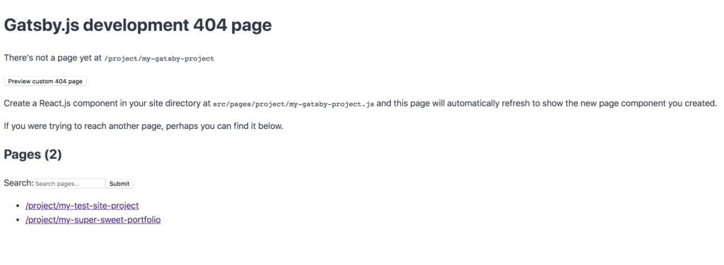
As you can see we have our project pages as “My Test Site Project” and “My Super Sweet Portfolio”! Awesome, now let’s look at component shadowing and how we can override our project template in gatsby-theme-portfolio/src/templates/project.js so we can customize our component in our test-site project.
Using Component Shadowing to Override Theme Components
One powerful feature of Gatsby Theme system is that it allows you to override a theme’s component in your own project. Gatsby calls this component shadowing which allows granular extension and customization of themes. You can read more about component shadowing on the Gatsby Blog What is Component Shadowing.
As per the instructions in the article on component shadowing all we need to do is replicate the component folder inside of our test-site directory by adding a sub-directory that is the name of the theme we are using. In order to override our gatsby-theme-portfolio/src/tempaltes/project.js file we will need to create a file file structure such as: test-site/src/gatsby-theme-portfolio/templates/project.js.
Component Shadowing uses a naming convention to determine which component will be rendered. In order to override the
Biocomponent ingatsby-theme-blog, create a file nameduser-site/src/gatsby-theme-blog/components/bio.jsAny file that lives in the
gatsbyjs.orgsrc/gatsby-theme-blogdirectory of the user’s site will be used instead of a file with the same name in the theme’ssrcdirectory:gatsby-theme-blog/src
Now with that folder structure in place and our project.js file copied over we are able to make customizations that should override our theme’s component. Let’s change up our project.js template a bit to make sure we are overriding our component with component shadowing:
/** @jsx jsx */
import { jsx, Flex, Box, Styled } from 'theme-ui'
import { graphql } from 'gatsby'

export const query = graphql`
  query($id: String!){
    project(id: {eq: $id}) {
      id
      slug
      name
      technologies
      url
    }
  }
`

const Project = ({ data: { project } }) => (
  <div
    sx={{
      maxWidth: ['full', '768px', '992px', '1200px'],
      mx: 'auto'
    }}>
    <Flex>
      <Box>
        <Styled.h1>{ project.name }</Styled.h1>
      </Box>
    </Flex>
    <Flex>
      <Box
        sx={{
          width: 'full'
        }}>
        <div
          sx={{
            boxShadow: 'lg',
            borderRadius: 'lg',
            borderColor: 'gray.2',
            borderStyle: 'solid',
            borderWidth: 1,
            backgroundColor: 'gray.1',
            p: 4,
            mt: 4
          }}>
            <Flex>
            { project.technologies.map((technology, key) => (
              <Box
               key={key}
               p={1}
               mx={2}>
                <span>{ technology }</span>
              </Box>
            )) }
            </Flex>
          </div>
      </Box>
    </Flex>
    <Flex>
      <Box
        sx={{
          width: 'full',
          mt: 4
        }}>
        <a
          href={project.url}
          sx={{
            variant: 'buttons.simple'
          }}>View Project</a>
      </Box>
    </Flex>
  </div>
)

export default Project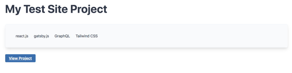
As you can see we have inherited all of the functionality we setup in Part One of How to Create Your Own Gatsby JS Theme as we are able to source our nodes using the gatsby-source-filesystem plugin (defined in our theme) and transform the sourced json into our GraphQL layer using gatsby-transformer-json and dynamically create pages using Gatsby’s createPages API all from our theme dependency gatsby-theme-portfolio and not from our test-site project. All we have to do to inherit all of the functionality from our Gatsby Theme is create a plugin dependency in test-site referencing our theme which in turn handle all of the functionality for us! This is powerful as you can abstract functionality into your theme you are creating and then use that theme throughout many Gatsby sites and/projects and only have to worry about the design and component shadowing in each project to make the project unique but inherit the functionality and templates from your Gatsby Theme!
We’ve come a long ways and between Part One and Part Two of this tutorial we have discussed how to create your own Gatsby theme and extend that theme to use in other projects. Hopefully you’ve seen a glimpse of the power and potential a Gatsby theme has and you are able to design your own themes and share them or use them in multiple Gatsby projects! Until next time, stay curious, stay creative.