Google’s New Logo
September 3rd 2015
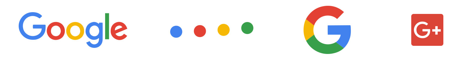
Oh yes they did! Google once again comes with a new logo. First glance pretty obvious that the serifs are gone! The colors are the same, no surprise there, those have been so consistent why change that now. One touch that I think is really nice is that if you look closely there is better sense of consistency. It no longer possesses the oval shape on the interior of the “o’s” and the “g.” Now all the circles are actual circles, and the everything is very geometric. Believe it or not people enjoy consistency and repetition. Creatures of habit we are. (Thanks Yoda!)
Now let’s take a minute and look at some of the auxiliary logos that come with this redesign.
The Dots
Are described as: “A dynamic distillation of the logotype for interactive, assistive, and transitional moments.”
Translation: Stare at our logo while you wait for the internet to catch up.
Again, simple, but brilliant. Colors are consistent, even the order, actual geometric circles, and repetition.
Google G
Described as: “A compact logo that works in small contexts.”
Translation: “That’s our icon!”
Obviously using the upper case “G” with the same colors, great geometry. My only concern with this version is that is borders on looking like Granite City’s “GC” logo. However with the addition of color, it breaks the “G” up in different spots than the Granite City logo. I do enjoy Google’s better because of those reasons.
Google +
Now I’m getting repetitious myself here, probably know how I feel about it by now. I like it better than the lowercase “g” version. I was never a big fan of cropping the old lowercase “g” even though you could still tell it was a “g” but I suppose the purpose was to focus on the “+.”
Now this one is really interesting, this is from 2009, and you notice how it embodies everything that has been previously been discussed. Geometry, color, repetition, it doesn’t say anything but you know exactly who it is, don’t you?