Gatsby Change Color Mode With Theme UI
May 17th 2020
Theme UI is a JavaScript library for creating constraint-based user interfaces. It has a number of advantages over vanilla CSS because of the dynamic JavaScript layer that allows intelligent component styling. The Theme UI library also comes with some React hooks that makes theming in React a breeze. Today we’re going to walk through dynamically changing the color mode of your theme on the fly by clicking a button so cycle through all of your theme’s color modes.
Gatsby Plugin Theme UI
Theme UI requires a custom theme object that will be passed in as the value to the <ThemeProvider> which wraps your gatsby project. Fortunately, there is a gatsby plugin gatsby-plugin-theme-ui that handles the context and theme provider for us. Once installed all we have to do is supply an exported object in our ./src/gatsby-plugin-theme-ui/index.js file and the component shadowing will use our theme object that we export as the context value for the <ThemeProvider> component. We can first install the plugin:
yarn add gatsby-plugin-theme-uiOnce installed we need to tell gatsby to use this plugin by opening up our gatsby-config.js file and adding:
module.exports = {
  ...
  plugins: [
    `gatsby-plugin-theme-ui`
  ]
  ...
}
Now we can also create a file located at ./src/gatsby-plugin-theme-ui called index.js and inside we can export an object:
export default {
  fonts: {
    body: 'system-ui, sans-serif',
    heading: '"Avenir Next", sans-serif',
    monospace: 'Menlo, monospace',
  },
  colors: {
    text: '#000',
    background: '#fff',
    primary: '#33e',
  },
}
This will export our theme object so our gatsby site will use this object as our theme specification values in our project. You can learn more about theme specification for declaring your theme object here: https://theme-ui.com/theme-spec.
Theme UI Color Modes
Theme UI allows for Color Modes. Color modes can be used to create a user-configurable dark mode or any number of other color modes. You can create a color mode by adding a modes object to our colors property of our theme definition. In our example let’s add a dark mode which is the inverse of the “default” light mode:
export default {
  fonts: {
    body: 'system-ui, sans-serif',
    heading: '"Avenir Next", sans-serif',
    monospace: 'Menlo, monospace',
  },
  colors: {
    text: '#000',
    background: '#fff',
    primary: '#33e',
    modes: {
      dark: {
        text: '#fff',
        background: '#000',
        primary: '#cc1'
      }
    }
  },
}
We can also set the default name of our initial color mode so we can reference it in our setColorMode hook which we will define later. We can set the default name by adding initialColorModeName property to our theme definition:
export default {
  initialColorModeName: 'light',
  fonts: {
    body: 'system-ui, sans-serif',
    heading: '"Avenir Next", sans-serif',
    monospace: 'Menlo, monospace',
  },
  colors: {
    text: '#000',
    background: '#fff',
    primary: '#33e',
    modes: {
      dark: {
        text: '#fff',
        background: '#000',
        primary: '#cc1'
      }
    }
  },
}
Now we essentially have “two” color modes in our theme: a light color mode and a dark color mode. We can toggle between these two modes by opening our layout.js file and importing the useColorMode hook from the theme-ui library. Initializing the hook we will obtain the current colorMode which will default to the initialColorModeName that we set in our ./src/gatsby-plugin-theme-ui/index.js file which evaluates to light. We can toggle the color mode between our default light mode and our dark mode by running a ternary conditional:
const nextColorMode = colorMode === 'light' ? 'dark' : 'light'We can use the nextColorMode variable and the setColorMode hook to toggle between the color modes:
/**
 * Layout component that queries for data
 * with Gatsby's useStaticQuery component
 *
 * See: https://www.gatsbyjs.org/docs/use-static-query/
 */

import React from "react"
import PropTypes from "prop-types"
import { useStaticQuery, graphql } from "gatsby"
import { useColorMode } from 'theme-ui'

import Header from "./header"

const Layout = ({ children }) => {
  const data = useStaticQuery(graphql`
    query SiteTitleQuery {
      site {
        siteMetadata {
          title
        }
      }
    }
  `)
  const [colorMode, setColorMode] = useColorMode()

  const nextColorMode = colorMode === 'light' ? 'dark' : 'light'

  return (
    <>
      <h3>Color Mode is: {colorMode}</h3>
      <button onClick={ e => {
        setColorMode(nextColorMode)
      }}>
        Change color mode
      </button>
      <Header siteTitle={data.site.siteMetadata.title} />
      <div>
        <main>{children}</main>
        <footer>
          © {new Date().getFullYear()}, Built with
          {` `}
          <a href="https://www.gatsbyjs.org">Gatsby</a>
        </footer>
      </div>
    </>
  )
}

Layout.propTypes = {
  children: PropTypes.node.isRequired,
}

export default Layout
Adding More Color Modes
We can add more theme color modes to our ./src/gatsby-plugin-theme-ui/index.js file:
export default {
  initialColorModeName: 'light',
  fonts: {
    body: 'system-ui, sans-serif',
    heading: '"Avenir Next", sans-serif',
    monospace: 'Menlo, monospace',
  },
  colors: {
    text: '#000',
    background: '#fff',
    primary: '#33e',
    modes: {
      dark: {
        text: '#fff',
        background: '#000',
        primary: '#cc1'
      },
      tomato: {
        text: '#565656',
        background: 'tomato',
        primary: 'tomato',
      },
      deep: {
        text: 'hsl(210, 50%, 96%)',
        background: 'hsl(230, 25%, 18%)',
        primary: 'hsl(260, 100%, 80%)',
      },
    }
  },
}
Now we have four color modes: our default mode which is the initialColorModeName set to light and the three others defined in our modes object: dark, tomato and deep. Now we can get all color modes by desctructuring the initialColorModeName from the useTheme hook and destructuring all of the modes and storing all of the mode keys in a variable called modeKeys making sure we add in our initialColorModeName as the first key to our array. Next, we can iterate over the array in a <select> element creating <option> elements for each key in our array. Finally, we can bind the onChange handler of our <select> to invoke the setColorMode function provided by the useColorMode hook:
/**
 * Layout component that queries for data
 * with Gatsby's useStaticQuery component
 *
 * See: https://www.gatsbyjs.org/docs/use-static-query/
 */

import React from "react"
import PropTypes from "prop-types"
import { useStaticQuery, graphql } from "gatsby"
import { useThemeUI, useColorMode } from 'theme-ui'

import Header from "./header"

const Layout = ({ children }) => {
  const data = useStaticQuery(graphql`
    query SiteTitleQuery {
      site {
        siteMetadata {
          title
        }
      }
    }
  `)
  const [colorMode, setColorMode] = useColorMode()

  const { theme: { initialColorModeName, colors: { modes } } } = useThemeUI()
  const modeKeys = Object.keys(modes)
  const allModes = [initialColorModeName, ...modeKeys]

  return (
    <>
      <h3>Color Mode is: {colorMode}</h3>
      <select onChange={ e => {
        setColorMode(e.target.value)
      }} value={colorMode}>
        { allModes.map(mode => (
          <option value={mode} key={mode}>{ mode }</option>
        ))}
      </select>
      <Header siteTitle={data.site.siteMetadata.title} />
      <div>
        <main>{children}</main>
        <footer>
          © {new Date().getFullYear()}, Built with
          {` `}
          <a href="https://www.gatsbyjs.org">Gatsby</a>
        </footer>
      </div>
    </>
  )
}

Layout.propTypes = {
  children: PropTypes.node.isRequired,
}

export default Layout
Result of Multiple Color Modes
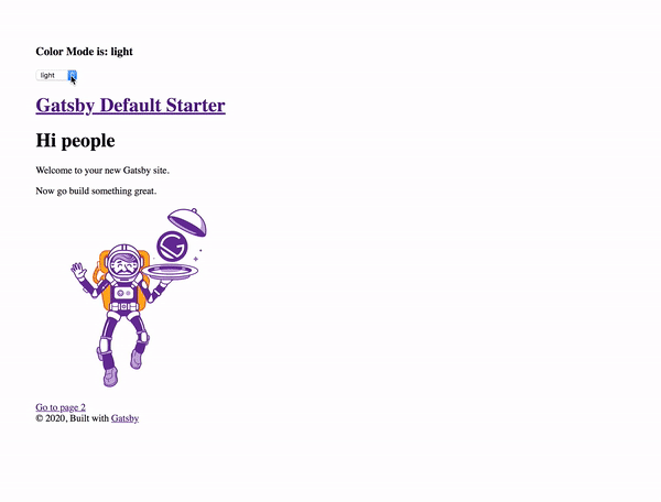
We have successfully created a “color mode picker” that toggles between all of the color modes defined in our theme object definition in ./src/gatsby-plugin-theme-ui/index.js file. We can extend this example by adding more themes! Hopefully this helps put a creative spin on your next Gatsby project!